
Wednesday, December 1, 2010
2010 12 Sarah's Gingerbread House Banner
Friday, November 5, 2010
2010 11 Jumping into Leaves Banner

Tuesday, October 5, 2010
2010 10 Sarah and the Witch Banner

The font is Haunting Attraction; r=255, g=120, b=0; drop shadow of 65% with x=1 y=1. The picture is rotated -36 to feature the important stuff. The border is made with shapes the same color as the font, plus an additional black border also made of shapes. The little witch on the right is the Vintage Stamp from Shabby Princess' free kit Holiday Sampler - Halloween. Behind the Vintage Stamp is the Dots-Black overlay--shrunk to 192 in the width and height.
Friday, October 1, 2010
Smashed Potatoes

The "Smashed" font is LDJ Squirrel Tracks. The "Potatoes" font is Arial.
Each picture has a size 5 black mat.
The background color is r=222, g=186, b=0 at 70% opacity.
Recipe Link
Thursday, September 2, 2010
2010 09 Chasing Rockets Banner

Friday, August 27, 2010
Cheesecake

The font is Broadway with a drop shadow (opacity=65%, x=1 y=1).
The two large pictures have rounded corners (30) and a size 2 white mat. Behind each large picture is a rectangular shape (r=112, g=198, b=203) with rounded corners (46) with a drop shadow (opacity=65%, blur=5, x=2 y=2). The small picture has a size 1 white mat. All three have a drop shadow (opacity=65%, blur=7, x=2 y=2).
The blue journaling papers are rectangular shapes (r=112, g=198, b=203) with a Scratch-White overlay. They have a drop shadow (opacity=65%, blur=7, x=3 y=4).
The elements come from Shabby Princesses' free kit Splendid. I used Peach and Purple Heart Jellies with a slightly smaller white circle shape behind each to make them seem opaque instead of translucent. The background paper is Peach Circles, over that is the paper Stripes (opacity=80%).
Recipe Link
Thursday, August 26, 2010
Dilly Panned Summer Squash

The font is Ariel, white, with a shadow (opacity=65%, x=1 y=1)
The background color is r=109, b=57, g=3, with a Scratch-White overlay.
The pictures have a size 4 mat (r=225, b=186, g=119) with one picture having rounded corners. Each picture has a drop shadow (opacity=65%, blur=7, x=2 y=2).
The Brown Floral Ribbon is from Sande Krieger's Mary Mary Quite Contrary, a free kit available through Two Peas in a Bucket. It has a drop shadow (opacity=65%, blur 7, x=3 y=4).
Recipe Link
Thursday, August 19, 2010
Congratulations College Girl!

The Background Color is r=204, g=0, b=0.
The main font is Arial, white.
The "SUU!" font is Algerian, with a black drop shadow with opacity 65%, x=1 y=1.
Each picture has a size 3 black mat.
Behind each pictures is a white shape with a size 2 black mat and a black drop shadow with opacity 65%, Blur 5, x=2 y=2.
The only Embellishment is a Scratch-Black Overlay (comes with MemoryMixer) in the background.
Thursday, August 5, 2010
Joseph Andrew Birth Announcement

The font is TXT Romanesque (red=53, green=26, blue=6). Shadow opacity is 40% with "We've got a new lil buckaroo!" @ x=1 y=1 and all other text @ x=0 y=0.
The background is Backgrounds/Texture/Nature/Wood. I turned on the 4x6 guides, but liked the top part of the picture best, so made my own guide to block off the bottom of the picture and then completed the design.
The picture is rotated 21 and has a shadow (Opacity=65%, Blur=7, x=2 y=2).
The journaling blocks are from Shabby Princess' free kit Harvest Spice. The long thin blocks are all one element called "Journaling Strips"(Shadow: Opacity=65%, Blur=7, x=3 y=4). The larger block at the bottom was an element called "FloralFrame_Vintage", but it was brought in as a photo and then cropped to it's current size (Shadow: Opacity=65%, Blur=7, x=2 y=2).
Monday, August 2, 2010
2010 08 Dad and Kristy at Henry's Fork Banner

Wednesday, July 21, 2010
2010 07 Rocket Car Banner

Tuesday, July 20, 2010
Volcano Cookies

The fonts are CAC Norm Heavy and Arial.
The pictures have a shadow (Opacity 65; Blur 7; X:2 Y:2). The largest picture has rounded corners. They have a size 4 mat of red=200, green=51, blue=32 on the RGB tab.
The elements are from Shabby Princess' free Sun Porch kit by Amy Teets.
The background paper is ateets_sunporch_pp_02. The journaling paper is ateets_sunporch_pp05, shrunk to size needed with a shadow (Opacity 65; Blur 7; X:3 Y:4). Also used is ateets_sunporch_journalingarrow plain.
Recipe Link
Thursday, July 15, 2010
Happy 50th Anniversary!

The font is Signet Roundhand with red=236, green=152, blue=45.
To get the background, click on Backgrounds/Texture/Nature/Lake.
The picture has a size 2 black mat with a shadow (Opacity 65; Blur 7; X:2 Y:2). It is then matted with a rectangle shape with red=138, green=89, blue=26, and an additional black mat with a shadow (Opacity 65; Blur 5; X:2 Y:2). Missionary insert pictures are matted the same.


Saturday, July 10, 2010
Yo, Sarah, it's your birthday!
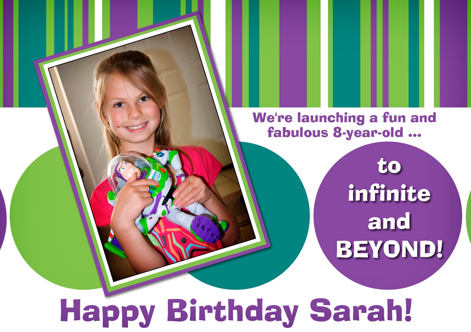
Colors
Green: red=150, green=194, blue=83
Teal: red=41, green=132, blue=128
Purple: red=122, green=74, blue=159
The font is AdLib BT. The text on the purple circle is white and has a shadow (Opacity=65%, X=1, Y=1).
The design is made with circle and rectangle shapes. The stripes on top began with a large green rectangle. I then added rectangles of varying width of white, teal, and purple. I didn't worry about placing the bottoms of the stripes evenly. When I was pleased with the design, I made a white rectangle the width of the card and placed it over all the other stripes, creating a clean edge.
The picture has a size 1 white mat and is rotated -17. It then has a green mat and a purple mat surrounding it. The purple mat has a shadow (Opacity=65%, Blur=5, X=2, Y=2).
Saturday, July 3, 2010

The font is Arial.
The picture has a size 4 white mat with a shadow (Opacity 65; Blur 7; X:2 Y:2).
The elements are from Two Peas in a Bucket's July free kit by Anne Langpap. When I downloaded my copy, it was called Aqua Net.
Three papers were used: Green Swirl, Aqua Net, and Pink Funky Dots. Other elements were: Scalloped Pink Robbon, Striped Ribbon, Pink Flower and Orange Flower. No shadows.
Thursday, July 1, 2010
Happy 22nd Anniversary

The font is "CAC Champagne". R=9; G=84; B=76
The Photo Shape was changed to Circle/Oval.
The elements are from Carrie Stevens' Spontaneous Delight.
The background is the background paper "swirly-floral". Opacity 80%
The journaling block is a Photo Block with the background paper "barely there" imported in, using the far right portion of the paper.
Other elements used were "glass dots", "glitter swirl", and "jeweled flower".
Saturday, June 19, 2010
Zucchini Ricotta Frittata

The font is "Elephant" with a shadow (Opacity 90%, X:1 Y:1).
The pictures have rounded corners (32) and have a shadow (Opacity 65; Blur 7; X:2 Y:2). They have a size 2 black mat.
Behind each picture is a white rounded corner shape (40) with a size 2 green (R=167;G=184;B=46) mat and another white rounded corner shape (50) with a size 2 black mat.
The elements I used were from Rhonna Farrer's free I Love You kit.
The background color is R=154;G=170;B=45. It is covered by the paper "Free3" (Opacity 5%). And the tag is "FreeTag1".
Recipe Links:
Asparagus Bacon Swiss Ricotta Frittata
Spinach Tomato Bacon Swiss Ricotta Frittata
Spinach Mushroom Ricotta Frittata
Zucchini Ricotta Frittata
Wednesday, June 16, 2010
Chicken Curry in a hurry!

The font is "Calligraph421 BT" with a shadow (Opacity 65%, X:1 Y:1).
The pictures have a shadow (Opacity 65; Blur 7; X:2 Y:2). Most of the pictures have had the photo shape changed to rounded corners. They have a size 4 white mat.
The elements I used were from Shabby Princess' free Happy Go Lucky kit.
The paper behind everything is "Paisley", but the color wasn't quite right, so I reduced the opacity to 87 and made a green Background Color of red=128, green=159, blue=76 on the RGB tab.
I chose the "Purple" paper to act as journaling blocks, just shrinking them to the size I needed. They have a shadow (Opacity 65; Blur 7; X:3 Y:4).
"Swirlie Stamp 2" is on the purple papers. The opacity is 61 and the opposite one has been flipped and mirrored. On the bottom paper, the left stamp has been flipped, mirrored and then manipulated a little bit so that the swirly that shows through is in just the right place.
Recipe Link
Monday, June 14, 2010
Kristen's RHS Graduation Announcement Picture
 Here's the final version of the picture Kristen sent out with her graduation announcements. Isn't she beautiful? Okay, let's see how it's done. Oh, and remember, you can click on the picture to get an enlarged view!
First, take 180 pictures (at three different locations) of your daughter (really, but don't worry, it will probably be fun--and she'll be moving away to college soon--so you'll be happy you did it!).
Then tell your daughter to pick her "favs". Then tell her to pick her "supa favs". By then you should have a reasonable number of pictures to choose from!
 Next, open up Memory Mixer 3. Before doing ANYTHING else:
Click on View.
Click on Guides.
Click on Crop Area - 4x6.
That is, if you are sending out a 4x6 picture. Which we did. :) Anyway, if you skip this step there's a good chance you'll work for hours and hours creating a work of art, only to go to print and realize it doesn't fit on the paper! Just like I did (sob!).
 Now we'll put on the picture used as the background.
Click on Edit Photo.
Click on Add Photo.
Navigate to wherever your desired picture is stored on your computer.
Click on your desired picture.
Click on OK.
Move and enlarge (or crop) your picture to fit the space.
I intentionally took this picture off center with the idea that we might want to put other information or pictures in the space on the right. If you're shooting pictures for an announcement of some kind, it's good to take a few shots like this. This picture was taken at the Jordan River Temple, right in front of the entrance. The light gravel walkway did a terrific job of acting like a reflector! That reflection, an overcast day, and a flash all contributed to a well-lit picture.
 Next we add the filmstrip embellishments.
Click on Embellishments.
Click on Add Embellishment.
Navigate to wherever you have your filmstrips.
Click on your black filmstrip.
Click on Apply.
Click on your white filmstrip.
Click on OK.
What's that? You don't have black or white filmstrips? If someone wants to tell me how I can give you mine, I'll do it. I made them a while back using Photoshop Elements and I've used them lots. When I do use them, I often prefer them to be transparent. They seem more "filmy" that way. The white filmstrip alone seemed too bright white to me--even with a reduced opacity, so I decided to put the black one underneath, also at a reduced opacity.
Set the white filmstrip opacity to 80.
Set the black filmstrip opacity to 49.
Set the rotation of both to -90. (They are pictured that way in the photo above.)
The white filmstrip has a shadow. With the white filmstrip selected, click on Drop Shadow and make the settings look like this:

At first when I was using this embellishment, I was frustrated because the spaces for the pictures didn't fit the 4x6 pictures that I was trying to put in them. Then I realized, "Duh, you can stretch the element to fit the pictures!" It was quite a revelation. This next step will get the openings to be the right size and to align the white and black filmstrips so that it really only looks like one single filmstrip. With each filmstrip, click on it to select it, click on Edit, uncheck Keep Proportions and make the settings look like this:
 Then, while I was messing around with one of the 15 versions of this project, I realized if I placed the pictures close together, and added a white border, I could make the pictures be any size I wanted! Like this:
 Now we ended up using the regular sized openings, but this is a useful thing to remember. And I discovered I liked the thin white border and decided to keep that. Just sharin' the things I learned along the way.
On to what we really ended up doing. To make it easier to try various photos, I used Photo Boxes because they keep their place and shape even if you change your mind on which picture you want to use in them. To get the three Photo Boxes in place:
Click on Edit Photo.
Click on Add Photo Box.
Click on Mat.
Reduce the size to 1.
Close the box.
Click on Edit.
Uncheck Keep Proportions.
X/Y coordinates should read: X: 593; Y: 46
Proportions should read: Width 110; Height: 166
Close the window.
While the box is still selected, copy the box by holding down Ctrl and press C and wait for the hourglass to go away--that lets you know the object has been copied. Then keep holding down Ctrl and press V. You should now have a copy of that Photo Box.
Now here's a problem that I've had with Memory Mixer 3. Sometimes I'll copy something, make adjustments assuming I'm working on the copy (which in previous versions has always been what is selected after making a copy), then when I go to move it somewhere I find out I was working on the original. So now after I copy things, I move it around first to make sure I've really got the copy selected. Once you've made sure you've got the copy, click on Edit and set X: 593 and Y: 217. Now you've got the middle box positioned right.
Follow the procedure above to create the third Photo Box. Set X: 593 and Y: 388.
Your picture should look like this:
 Now put in the pictures you want! Either double-click on the box to add a photo, or drop and drag from the options on the right. Remember you can adjust the way the picture is cropped by double-clicking on the picture or clicking Crop, or using the Zoom or Nudge options. We ended up with these:
Finally we document her school and graduating class!
Click on Titles and Journaling.
Click on Add Text.
We used the font "TXT Romanesque". Select whatever font you have and like.
Set the Font Size: 15 (Although if you use a different font, you may have to adjust the size.)
We changed the color to match the purple shirt by clicking on More Colors, Picker, and selecting one of the pixels on her shirt. It turns out to be Red: 40; Green: 23; Blue: 97 on the RGB tab. Close the window.
Now type the name of the school.
Click Okay.
Rotate the text to -90.
Drag the text to where you want it on the film strip. (Hey, Memory Mixer people! In your next version, let's have the ability to move the text around just like we move everything else--using the X/Y coordinates!)
Now copy the text (your should know how to do this after all the copying of Photo Boxes above) and move it around to make sure you're working on the copy.
Click on Edit Text.
Replace your school name with the class info.
Click Okay.
Drag the text to where you want it on the film strip.
And, voila! You've got a fabulous picture to include in your Graduation Announcements!
 Of course you still have to print this out. I am ashamed to say I've never figured out how to get a satisfactory print using the File/Print option. So here's what I do.
Click on Share Album.
Click on Export to JPEG...
Click OK.
Click Next.
Click Clear All.
Select the page you've been working on.
Click Next.
Choose export image size as Large.
Click Next.
Navigate to where you want to save the file and click Next.
Click Export.
Now you've got a JPEG ready to import into Photoshop, crop to 4x6, and print away! This was a really fun project to do! Hope you enjoy it too!
Tuesday, June 1, 2010

Saturday, May 1, 2010
2010 05 Blowing Bubbles Banner

Thursday, April 1, 2010

Monday, March 1, 2010

Subscribe to:
Posts (Atom)