

Thursday, September 1, 2011


Monday, February 28, 2011
2011 03 Kristen Rock Climbing Banner

The font for Have Fun, Be Good is Georgia (R=234, G=223, B=200), with a drop shadow (opacity=65%, x=1 y=1). The other font is Trebuchet (R=210, G=225, B=176), with a drop shadow (opacity=65%, x=1 y=1). The embellishments come from Shabby Princess' free kit called The PROMISE Collection.
Wednesday, February 2, 2011
2011 02 Kathryn's Flute Banner

The font for Have Fun, Be Good is Georgia, matching the color of the sunny side of Kathryn's face (R=255, G=240, B=232), with a drop shadow (opacity=65%, x=1 y=1). The other font is Trebuchet (R=233, G=214, B=201), with a drop shadow (opacity=65%, x=1 y=1).
Thursday, January 13, 2011
2011 01 Cross Country Skiing Banner

The font for Have Fun, Be Good is Georgia, matching the color of the snow (R=218,G=231,B=244), with a drop shadow (opacity=65%, x=1 y=1). The other font is Trebuchet (color the same). I only added one element: the word "reach". I'm pretty sure it came from Two Peas in a Bucket, but I can't seem to find it there anymore. It was part of a Free kit entitled "Pink October" that was part of a Breast Cancer awareness campaign. If anyone has the link for it, let me know. Anyway, I just thought "reach" was good for beginning a new year - resolutions and all that. :) Oh, that's Jeff, Mat, and Kathryn--having a good time! :)
Wednesday, December 1, 2010
2010 12 Sarah's Gingerbread House Banner

Friday, November 5, 2010
2010 11 Jumping into Leaves Banner

Tuesday, October 5, 2010
2010 10 Sarah and the Witch Banner

The font is Haunting Attraction; r=255, g=120, b=0; drop shadow of 65% with x=1 y=1. The picture is rotated -36 to feature the important stuff. The border is made with shapes the same color as the font, plus an additional black border also made of shapes. The little witch on the right is the Vintage Stamp from Shabby Princess' free kit Holiday Sampler - Halloween. Behind the Vintage Stamp is the Dots-Black overlay--shrunk to 192 in the width and height.
Friday, October 1, 2010
Smashed Potatoes

The "Smashed" font is LDJ Squirrel Tracks. The "Potatoes" font is Arial.
Each picture has a size 5 black mat.
The background color is r=222, g=186, b=0 at 70% opacity.
Recipe Link
Thursday, September 2, 2010
2010 09 Chasing Rockets Banner

Friday, August 27, 2010
Cheesecake

The font is Broadway with a drop shadow (opacity=65%, x=1 y=1).
The two large pictures have rounded corners (30) and a size 2 white mat. Behind each large picture is a rectangular shape (r=112, g=198, b=203) with rounded corners (46) with a drop shadow (opacity=65%, blur=5, x=2 y=2). The small picture has a size 1 white mat. All three have a drop shadow (opacity=65%, blur=7, x=2 y=2).
The blue journaling papers are rectangular shapes (r=112, g=198, b=203) with a Scratch-White overlay. They have a drop shadow (opacity=65%, blur=7, x=3 y=4).
The elements come from Shabby Princesses' free kit Splendid. I used Peach and Purple Heart Jellies with a slightly smaller white circle shape behind each to make them seem opaque instead of translucent. The background paper is Peach Circles, over that is the paper Stripes (opacity=80%).
Recipe Link
Thursday, August 26, 2010
Dilly Panned Summer Squash

The font is Ariel, white, with a shadow (opacity=65%, x=1 y=1)
The background color is r=109, b=57, g=3, with a Scratch-White overlay.
The pictures have a size 4 mat (r=225, b=186, g=119) with one picture having rounded corners. Each picture has a drop shadow (opacity=65%, blur=7, x=2 y=2).
The Brown Floral Ribbon is from Sande Krieger's Mary Mary Quite Contrary, a free kit available through Two Peas in a Bucket. It has a drop shadow (opacity=65%, blur 7, x=3 y=4).
Recipe Link
Thursday, August 19, 2010
Congratulations College Girl!

The Background Color is r=204, g=0, b=0.
The main font is Arial, white.
The "SUU!" font is Algerian, with a black drop shadow with opacity 65%, x=1 y=1.
Each picture has a size 3 black mat.
Behind each pictures is a white shape with a size 2 black mat and a black drop shadow with opacity 65%, Blur 5, x=2 y=2.
The only Embellishment is a Scratch-Black Overlay (comes with MemoryMixer) in the background.
Thursday, August 5, 2010
Joseph Andrew Birth Announcement

The font is TXT Romanesque (red=53, green=26, blue=6). Shadow opacity is 40% with "We've got a new lil buckaroo!" @ x=1 y=1 and all other text @ x=0 y=0.
The background is Backgrounds/Texture/Nature/Wood. I turned on the 4x6 guides, but liked the top part of the picture best, so made my own guide to block off the bottom of the picture and then completed the design.
The picture is rotated 21 and has a shadow (Opacity=65%, Blur=7, x=2 y=2).
The journaling blocks are from Shabby Princess' free kit Harvest Spice. The long thin blocks are all one element called "Journaling Strips"(Shadow: Opacity=65%, Blur=7, x=3 y=4). The larger block at the bottom was an element called "FloralFrame_Vintage", but it was brought in as a photo and then cropped to it's current size (Shadow: Opacity=65%, Blur=7, x=2 y=2).
Monday, August 2, 2010
2010 08 Dad and Kristy at Henry's Fork Banner

Wednesday, July 21, 2010
2010 07 Rocket Car Banner

Tuesday, July 20, 2010
Volcano Cookies

The fonts are CAC Norm Heavy and Arial.
The pictures have a shadow (Opacity 65; Blur 7; X:2 Y:2). The largest picture has rounded corners. They have a size 4 mat of red=200, green=51, blue=32 on the RGB tab.
The elements are from Shabby Princess' free Sun Porch kit by Amy Teets.
The background paper is ateets_sunporch_pp_02. The journaling paper is ateets_sunporch_pp05, shrunk to size needed with a shadow (Opacity 65; Blur 7; X:3 Y:4). Also used is ateets_sunporch_journalingarrow plain.
Recipe Link
Thursday, July 15, 2010
Happy 50th Anniversary!

The font is Signet Roundhand with red=236, green=152, blue=45.
To get the background, click on Backgrounds/Texture/Nature/Lake.
The picture has a size 2 black mat with a shadow (Opacity 65; Blur 7; X:2 Y:2). It is then matted with a rectangle shape with red=138, green=89, blue=26, and an additional black mat with a shadow (Opacity 65; Blur 5; X:2 Y:2). Missionary insert pictures are matted the same.


Saturday, July 10, 2010
Yo, Sarah, it's your birthday!
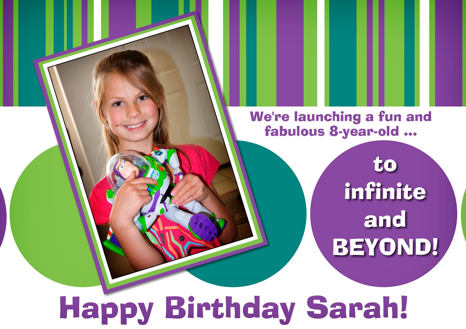
Colors
Green: red=150, green=194, blue=83
Teal: red=41, green=132, blue=128
Purple: red=122, green=74, blue=159
The font is AdLib BT. The text on the purple circle is white and has a shadow (Opacity=65%, X=1, Y=1).
The design is made with circle and rectangle shapes. The stripes on top began with a large green rectangle. I then added rectangles of varying width of white, teal, and purple. I didn't worry about placing the bottoms of the stripes evenly. When I was pleased with the design, I made a white rectangle the width of the card and placed it over all the other stripes, creating a clean edge.
The picture has a size 1 white mat and is rotated -17. It then has a green mat and a purple mat surrounding it. The purple mat has a shadow (Opacity=65%, Blur=5, X=2, Y=2).
Saturday, July 3, 2010

The font is Arial.
The picture has a size 4 white mat with a shadow (Opacity 65; Blur 7; X:2 Y:2).
The elements are from Two Peas in a Bucket's July free kit by Anne Langpap. When I downloaded my copy, it was called Aqua Net.
Three papers were used: Green Swirl, Aqua Net, and Pink Funky Dots. Other elements were: Scalloped Pink Robbon, Striped Ribbon, Pink Flower and Orange Flower. No shadows.
Subscribe to:
Posts (Atom)